Mar 3, 2025
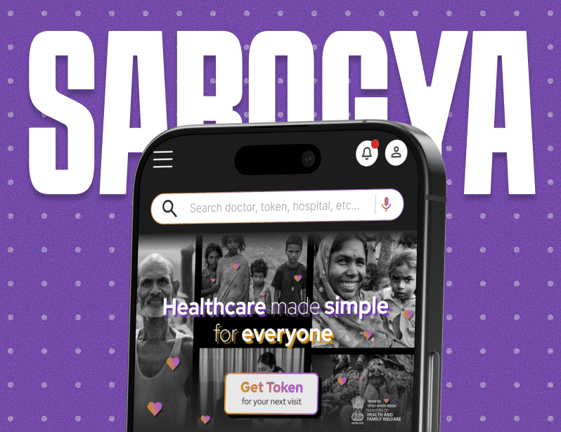
SAROGYA : Quick Healthcare Access for All
SAROGYA : Quick Healthcare Access for All
Sarogya reimagines the chaotic experience of government hospitals by introducing a simple, intuitive token and navigation system, designed for smartphones, kiosks, and even basic SMS. By bridging digital and offline touchpoints, it saves time for patients, reduces staff overload, and builds trust in public healthcare.
Sarogya reimagines the chaotic experience of government hospitals by introducing a simple, intuitive token and navigation system, designed for smartphones, kiosks, and even basic SMS. By bridging digital and offline touchpoints, it saves time for patients, reduces staff overload, and builds trust in public healthcare.
Role : UX Research, Task Flow Mapping, Inclusive Design, Interactive Prototyping.
Imagine This
You suddenly remembered that today is your hospital visit date...
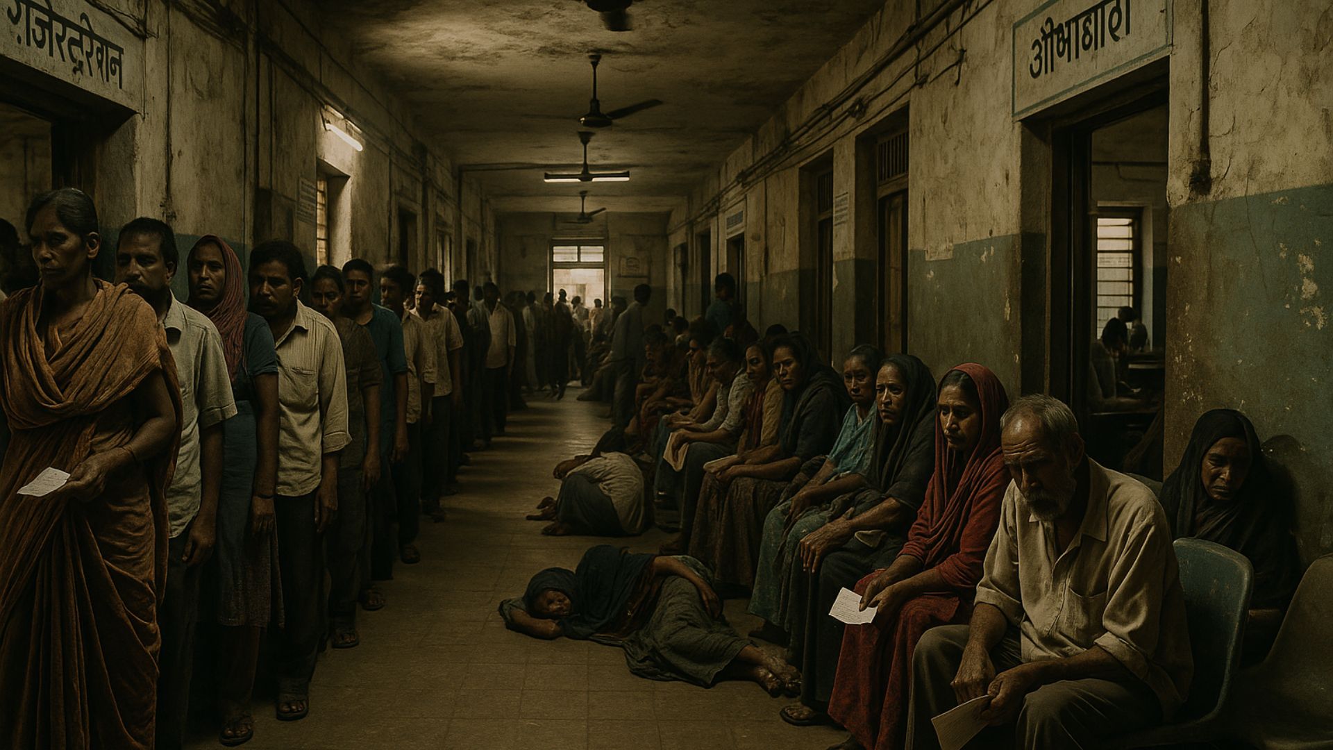
You walk into a chaotic government hospital. The smell of antiseptic, the sound of chaos. A child cries in one corner, an old man clutches a file confusedly. New to the city so not sure which counter to go to...
Or Your mother isn’t well. You’ve taken a day off work,
reached the hospital early, and yet you’re still waiting in long que, with physical medical papers, You don’t know if your regular doctor is available & not sure when all of this will be over.
No token system. No signage. No order.
Just frustration, lost time, and anxiety.
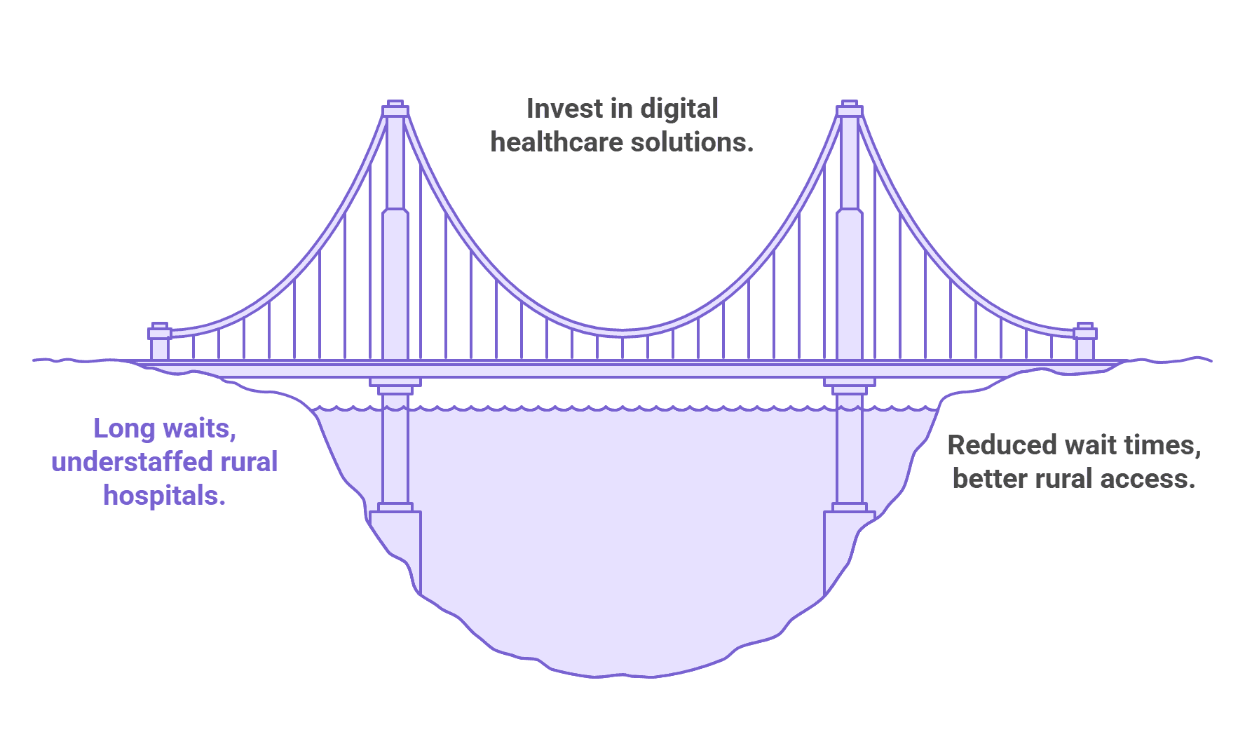
Why does It matter?
On average, 90% of public hospital visits result in patients waiting around 22–25 minutes before consultation
74% of doctors work in urban areas, serving only 28% of the population, leaving rural hospitals
severely understaffedEvidence-based digital investments can help governments save up to 15% on overall health system costs.
At Hyderabad’s NIMS hospital, a queuing system helped increase patient throughput by 235%
(from ~85 to ~285 patients/hour) .
Problem Statement
Patients in Indian government hospitals often face confusion, long waits, and poor communication. With no digital queue, unclear navigation, and paper-based records, accessing care is frustrating and inefficient, especially for those in Tier 2 and Tier 3 cities. There’s a need for a simple, inclusive system that works across devices, languages, and tech familiarity.
Goals & Objectives
Bring order to chaotic hospital experiences
Reduce wait times and confusion
Assist non-tech users via kiosks and SMS
Ensure multilingual, intuitive UX
Make healthcare accessible across all tech levels
Enable document-free appointments
Digitize records, prescriptions, and reports
Support hospital staff with structured backend
Sarogya
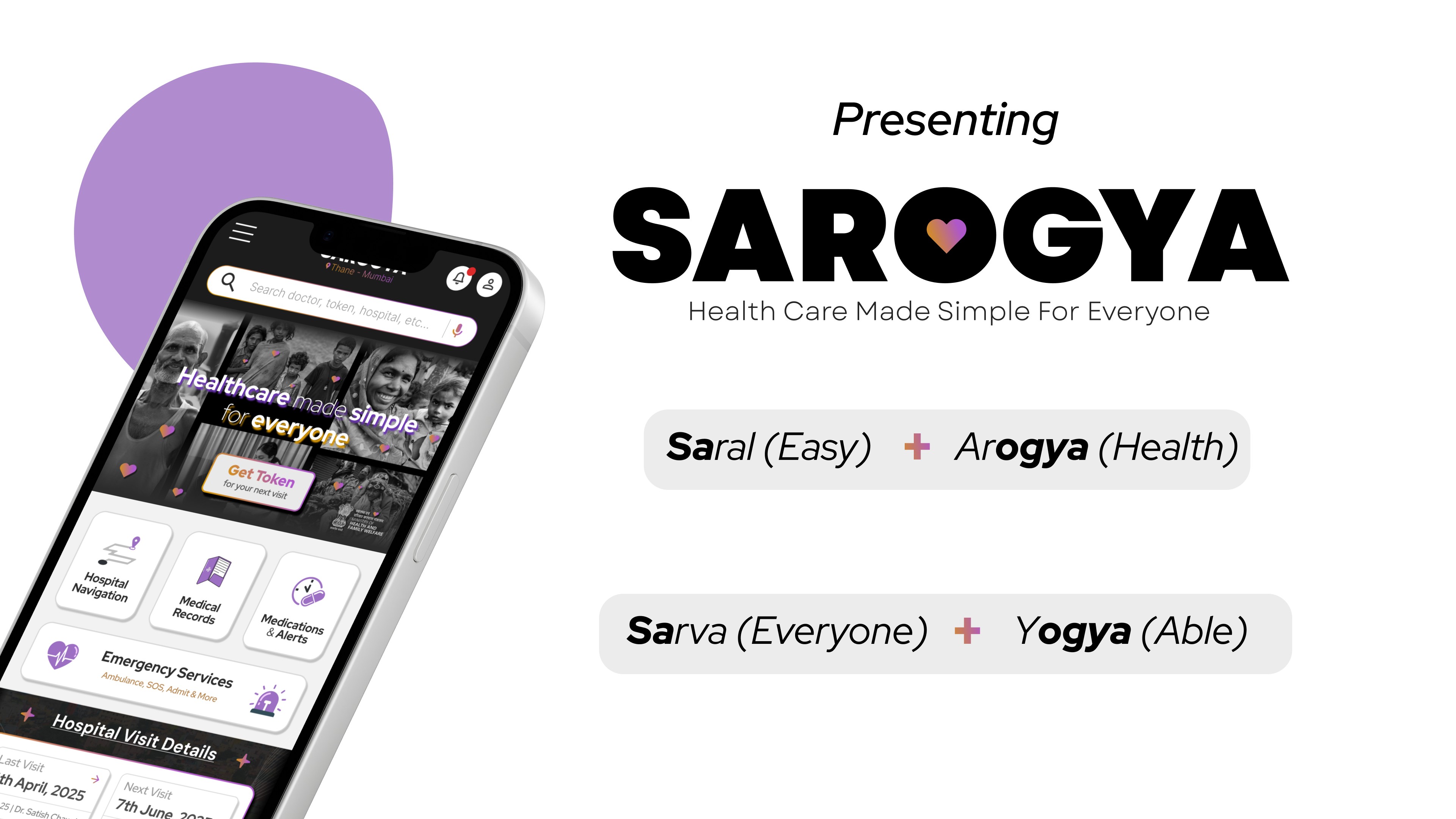
Sarogya is an inclusive health-tech solution aimed at streamlining the government hospital experience in India. Whether you own a smartphone, a keypad phone, or no phone at all. Sarogya helps you get tokens, track appointments, navigate departments, and manage medical records effortlessly. It works across smartphones, hospital kiosks, and even SMS, ensuring no one is left behind.
Secondary Research (Data from credible sources)
75% of the Indian population relies on public healthcare. (NSSO Report)
Average waiting time in public OPDs: 3–6 hours (IndiaSpend, 2022)
Only 44% of Indians use smartphones with regular internet access (Statista, TRAI)
Paper-based medical records are still the norm in most government hospitals.
Lack of signage and digital queue systems leads to confusion and delay.
Doctor absenteeism in Tier 2/3 hospitals reported at ~20–25%. (India Today, RTI Data)
Insight: The lack of structured communication and appointment systems directly impacts care delivery and
user experience.
Competitive Analysis
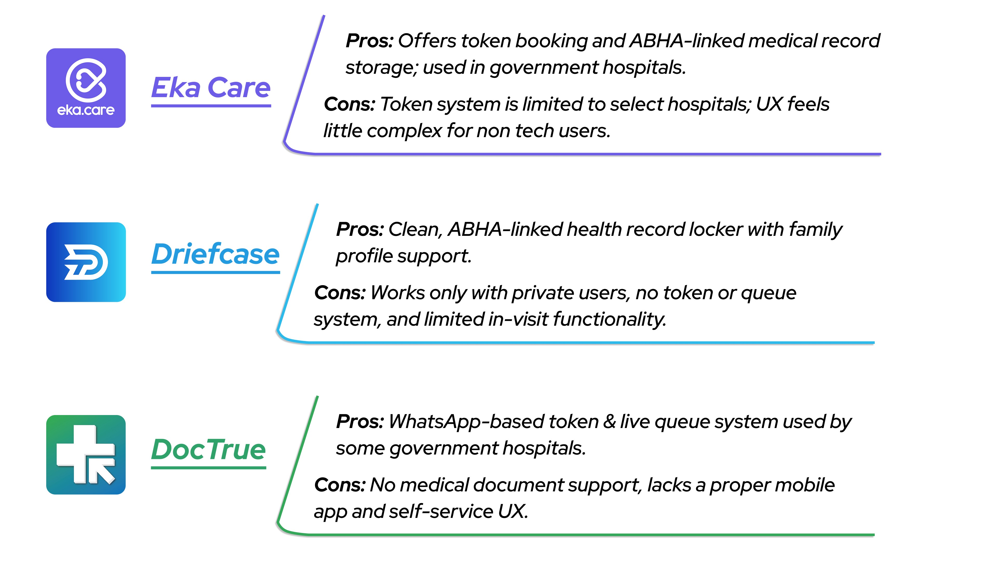
Conclusion: Most competitors either work in private clinics only or offer partial solutions in government settings.
Sarogya is built from the ground up to serve both public and private healthcare systems, especially focusing on government hospital use where the need for smoother tokens and document management is the highest.
Primary Research (Informal interviews and observational insights)
To understand the current challenges in government hospitals, I conducted qualitative research through interviews and personal visits. I spoke with 4 patients from different regions (urban & rural), 1 hospital MBBS d octor, and consulted with 2 general physicians. These participants varied in age, tech literacy, and experience with public healthcare.
Key Observations
No token or appointment system, first-come, first-served chaos
Patients rely on word of mouth or security guards to navigate
Paper-based records often misplaced or illegible
Staff spends time repeating instructions and handling crowd management
Many are unsure about medication timings & days / Wrong indulgence
Patients often don’t know if their regular doctor is available or not
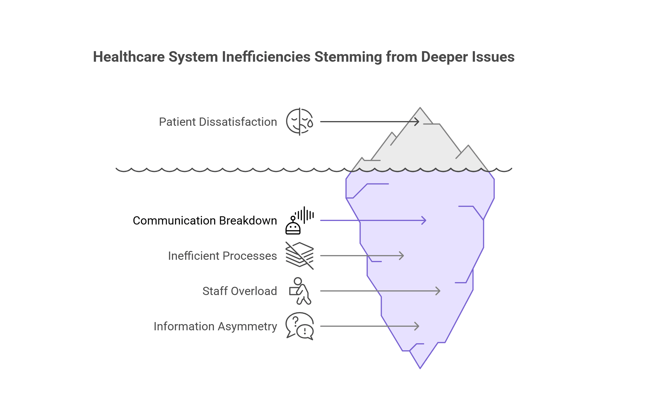
Insight: It’s not just overcrowding, it’s disorganization at every level. Patients want clarity and not luxury. A token system, centralized medical history, visit reminders, and clear navigation can drastically reduce confusion and bring dignity, efficiency, and trust back into public healthcare.
User Personas
Category 1 : Smartphone-Enabled Users
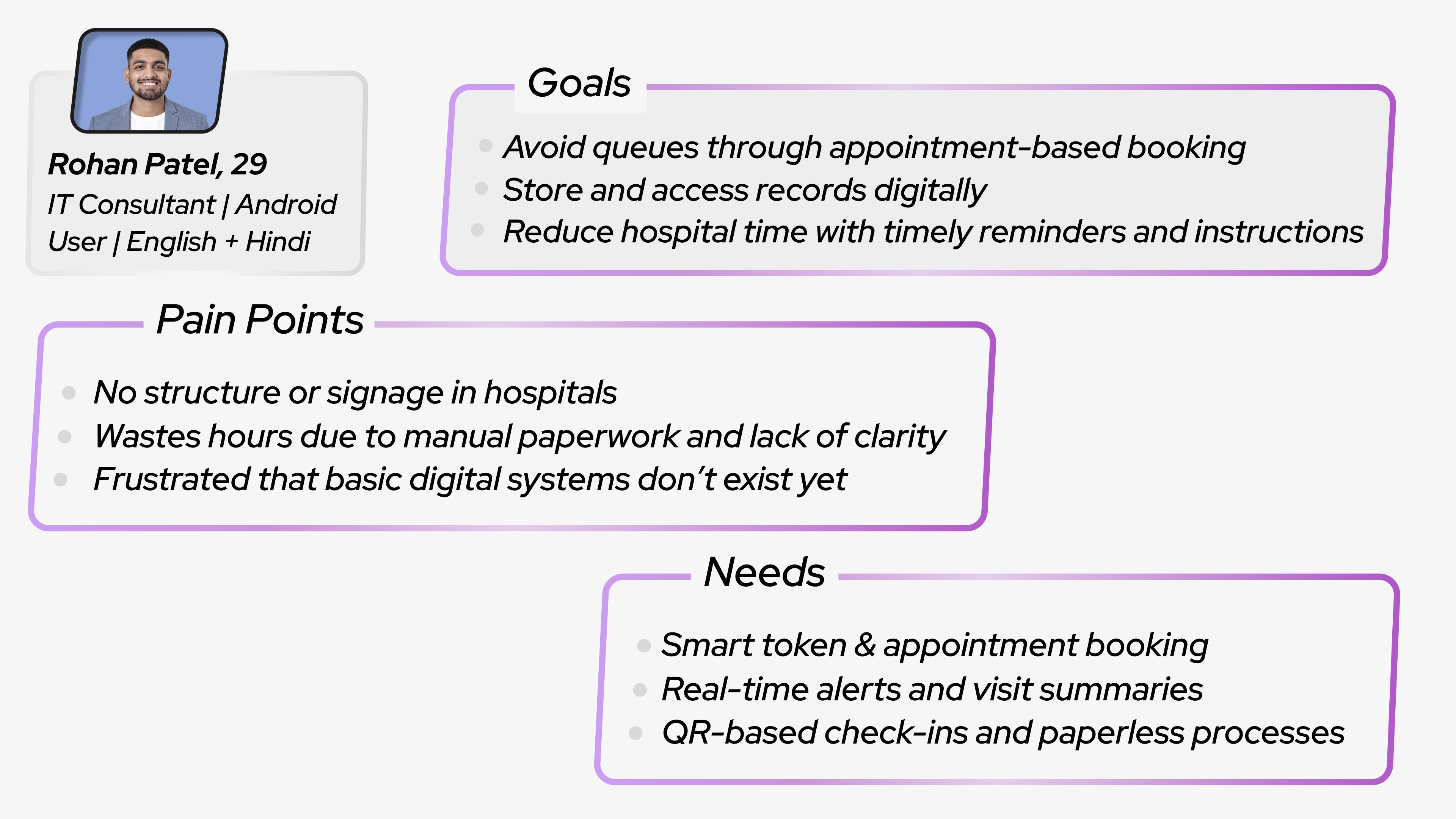
User story: “As a tech-savvy patient, I need a simple appointment booking system with real-time updates so that I can avoid long queues and get treated on time without confusion.”
*Emotion / Quote :- "I don’t mind going to a government hospital — if it just worked like an app booking system, I’d save half my day”*
_______________________________________________________________________
Category 2 : Basic Smartphone or Feature Phone Users
User story: “As low-tech users, we need a simple system—either through a basic app or
SMS—so that we can access hospital services without confusion or relying on others.”
*You might ask why Ramesh doesn’t help Suresh. Well… they don’t talk anymore. Why? Let’s not get personal — back to the case study*
_______________________________________________________________________
Category 3 : No Phone, Lost phone Or Offline users
User story: “I need a clear, guided kiosk at the hospital entrance so that I can register myself and know exactly where to go and when, without asking around.”
_______________________________________________________________________
*Category 4 will be Backend Users, Staff & Doctors but I am not including them for this case study*
_______________________________________________________________________
How Might We (HMW) Statements
How might we introduce a simple token-based appointment system for patients visiting so that they don’t waste hours standing in unorganized queues?
How might we design an intuitive kiosk experience for patients with no smartphones or low literacy so that they can register and navigate the hospital independently?
How might we create a lightweight, multilingual app for users with basic or old Android phones so that they can access appointments, records, and alerts without tech barriers?
How might we centralize medical documents and visit history for repeat patients at government hospitals so that they don’t have to carry physical files every time?
How might we send timely reminders and updates for users who forget follow-ups or medication schedules so that they stay on track with their treatment without needing app notifications?
Site Map Based on Information Architecture
*Zoom in plz* :)
User Flows
*Zoom in agin 3 times plz* :)
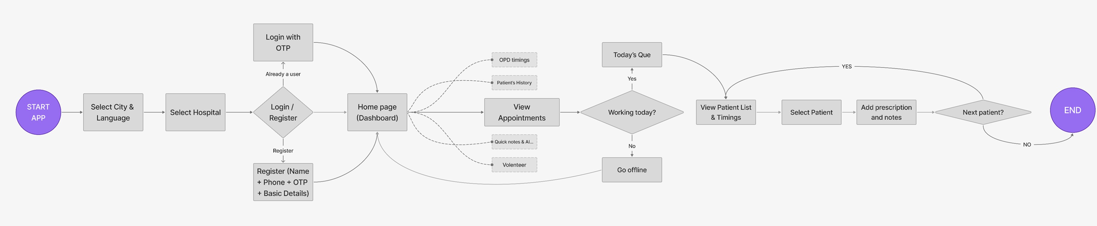
🡻 Flow For getting token from smart phone (Patients)
🡻 Flow For Seeing appointments (Doctors)
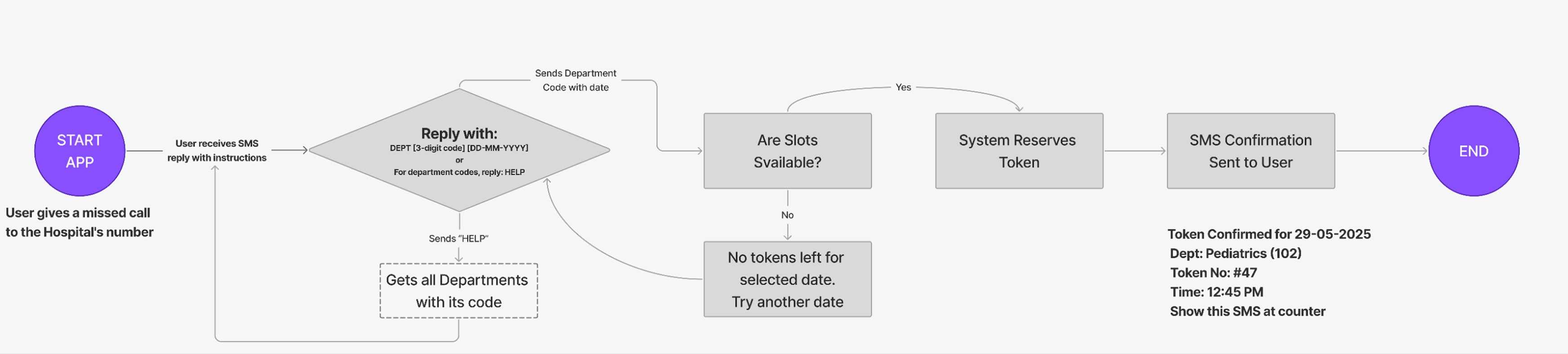
🡻 Flow For getting token from Non-smart phone (Patients)
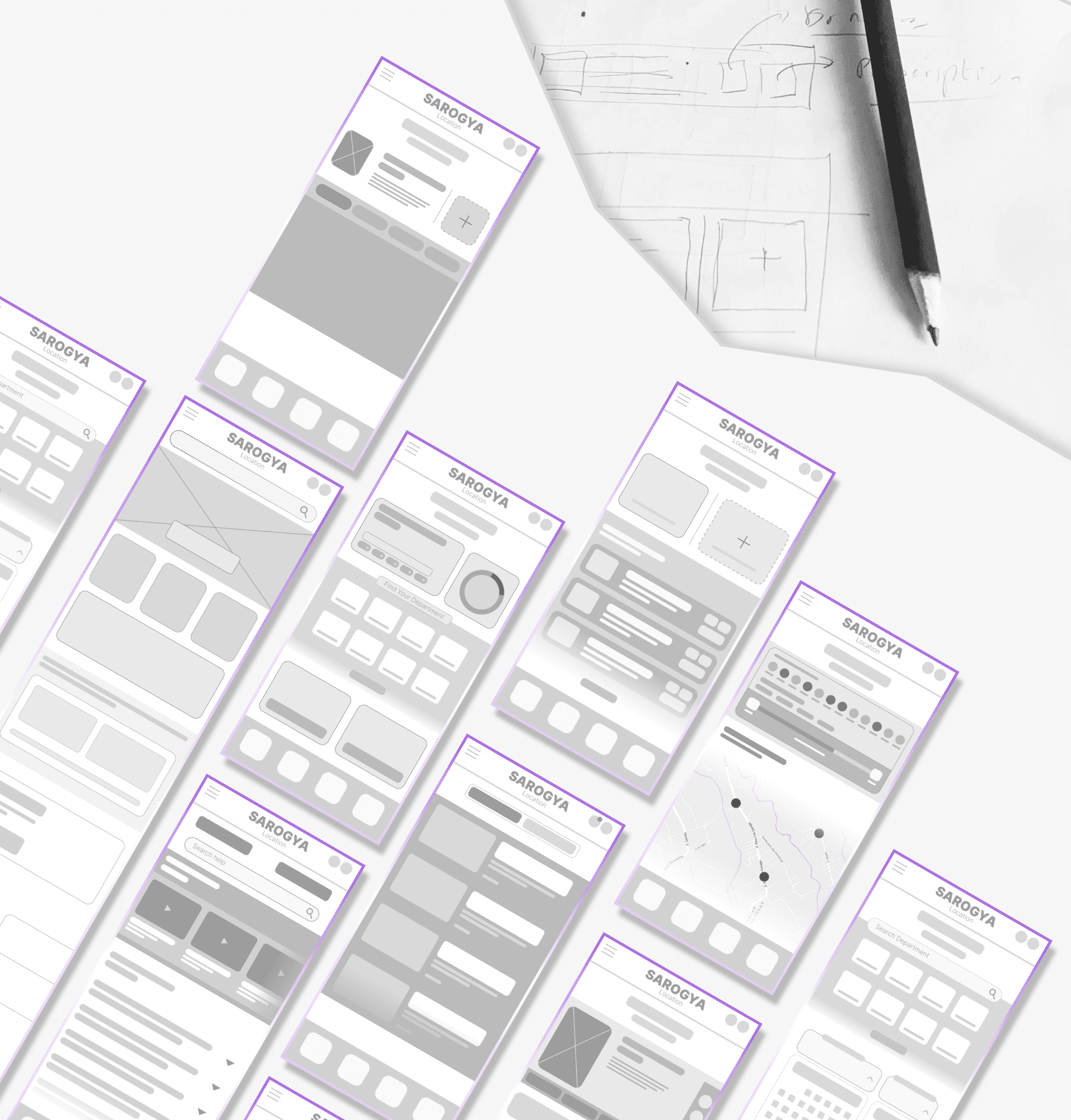
Wireframes
My Process usually starts from paper wireframes but very quickly goes to making wireframes on my laptop. personally i like digital wireframes more than the paper ones because it can give me a close sense of how the app will look in real life.
Hi-Fi Prototypes
My goal was to create a hospital queue management system that works equally well for tech-savvy patients, basic phone users, and completely offline visitors. The focus was on clear navigation, local language support, and a system that reduces wait times while minimizing confusion. These prototypes explore how a single solution can function across kiosks, mobile apps, and printed tokens — ensuring accessibility for every patient type
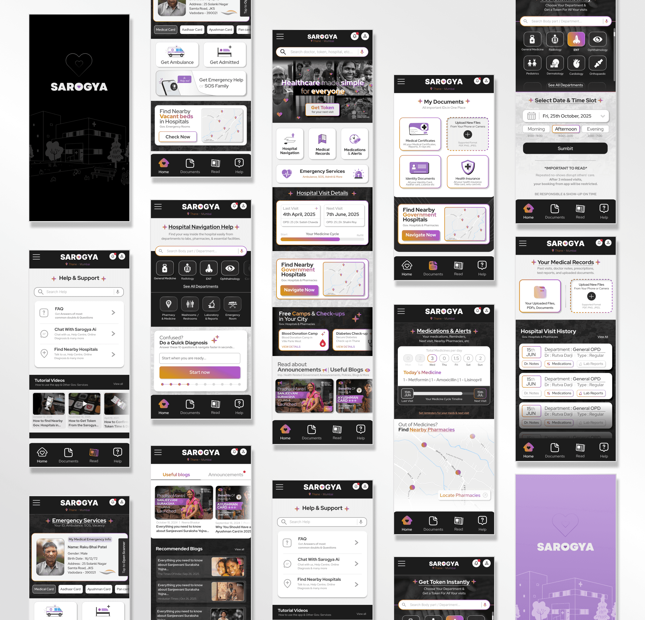
Every design choice was intentional, focused on empowering users with access, clarity, and control over their health. Here's how I approached the UX and UI:
Digital-First Healthcare Documentation
Enabled users to securely access and store:
All necessary ID documents (for verification),
Doctor’s notes from past visits,
Upcoming appointment schedules,
Prescribed medications for the day.
Designed with mobile-first convenience: even if users only have their phone, they have everything they need.
Multi-Platform Access for All Users
Ensured the platform is inclusive and adaptable to different levels of digital access:
Kiosk UI Design mirrors the mobile experience but with a simplified layout for quick navigation in public hospital settings.
For users without smartphones, basic token generation via SMS is supported, ensuring even low-tech users can queue for services.
This approach makes the app accessible across smartphones, kiosks, and feature phones, without diluting the core value.
Smart Accessibility & Location Integration
Seamless Google Maps integration allows users to:
Find nearby government medical pharmacies,
Check for available government hospital beds in real time,
Discover local free/paid checkup camps and donation drives.
The experience auto-adjusts based on user’s city and location.
Personal Health Assistant Features
Users can view:
Their next and last doctor visit dates,
A daily medication tracker – making it easier to stay consistent with treatment.
Clarity-Driven Visual Language
Chose iconography that clearly communicates functions, making navigation intuitive for users of all literacy levels.
Crafted a modern color theme that feels welcoming, avoiding the cold, clinical aesthetic often associated with hospitals.
Action-Oriented UI Design
Prioritized primary CTA buttons by increasing their size and visibility — helping users take action with confidence.
Clean, distraction-free layout that guides users naturally through key flows.
Educational & Policy Awareness Section
Curated a blog-style section with:
Easy-to-understand government health policy explainers,
Real-time announcements about new schemes, subsidies, and public health updates.
This helps build trust and literacy around the healthcare system, especially for underserved users.
This app is more than a service, it’s a digital public health companion. Every feature was designed to solve real-world problems, especially for users who depend on government healthcare systems. I focused on making health access simple, human, and dignified.
Thank you for reading! :)
Imagine This
You suddenly remembered that today is your hospital visit date...
You walk into a chaotic government hospital. The smell of antiseptic, the sound of chaos. A child cries in one corner, an old man clutches a file confusedly. New to the city so not sure which counter to go to...
Or Your mother isn’t well. You’ve taken a day off work,
reached the hospital early, and yet you’re still waiting in long que, with physical medical papers, You don’t know if your regular doctor is available & not sure when all of this will be over.
No token system. No signage. No order.
Just frustration, lost time, and anxiety.
Why does It matter?
On average, 90% of public hospital visits result in patients waiting around 22–25 minutes before consultation
74% of doctors work in urban areas, serving only 28% of the population, leaving rural hospitals
severely understaffedEvidence-based digital investments can help governments save up to 15% on overall health system costs.
At Hyderabad’s NIMS hospital, a queuing system helped increase patient throughput by 235%
(from ~85 to ~285 patients/hour) .
Problem Statement
Patients in Indian government hospitals often face confusion, long waits, and poor communication. With no digital queue, unclear navigation, and paper-based records, accessing care is frustrating and inefficient, especially for those in Tier 2 and Tier 3 cities. There’s a need for a simple, inclusive system that works across devices, languages, and tech familiarity.
Goals & Objectives
Bring order to chaotic hospital experiences
Reduce wait times and confusion
Assist non-tech users via kiosks and SMS
Ensure multilingual, intuitive UX
Make healthcare accessible across all tech levels
Enable document-free appointments
Digitize records, prescriptions, and reports
Support hospital staff with structured backend
Sarogya
Sarogya is an inclusive health-tech solution aimed at streamlining the government hospital experience in India. Whether you own a smartphone, a keypad phone, or no phone at all. Sarogya helps you get tokens, track appointments, navigate departments, and manage medical records effortlessly. It works across smartphones, hospital kiosks, and even SMS, ensuring no one is left behind.
Secondary Research (Data from credible sources)
75% of the Indian population relies on public healthcare. (NSSO Report)
Average waiting time in public OPDs: 3–6 hours (IndiaSpend, 2022)
Only 44% of Indians use smartphones with regular internet access (Statista, TRAI)
Paper-based medical records are still the norm in most government hospitals.
Lack of signage and digital queue systems leads to confusion and delay.
Doctor absenteeism in Tier 2/3 hospitals reported at ~20–25%. (India Today, RTI Data)
Insight: The lack of structured communication and appointment systems directly impacts care delivery and
user experience.
Competitive Analysis
Conclusion: Most competitors either work in private clinics only or offer partial solutions in government settings.
Sarogya is built from the ground up to serve both public and private healthcare systems, especially focusing on government hospital use where the need for smoother tokens and document management is the highest.
Primary Research (Informal interviews and observational insights)
To understand the current challenges in government hospitals, I conducted qualitative research through interviews and personal visits. I spoke with 4 patients from different regions (urban & rural), 1 hospital MBBS d octor, and consulted with 2 general physicians. These participants varied in age, tech literacy, and experience with public healthcare.
Key Observations
No token or appointment system, first-come, first-served chaos
Patients rely on word of mouth or security guards to navigate
Paper-based records often misplaced or illegible
Staff spends time repeating instructions and handling crowd management
Many are unsure about medication timings & days / Wrong indulgence
Patients often don’t know if their regular doctor is available or not
Insight: It’s not just overcrowding, it’s disorganization at every level. Patients want clarity and not luxury. A token system, centralized medical history, visit reminders, and clear navigation can drastically reduce confusion and bring dignity, efficiency, and trust back into public healthcare.
User Personas
Category 1 : Smartphone-Enabled Users
User story: “As a tech-savvy patient, I need a simple appointment booking system with real-time updates so that I can avoid long queues and get treated on time without confusion.”
*Emotion / Quote :- "I don’t mind going to a government hospital — if it just worked like an app booking system, I’d save half my day”*
_______________________________________________________________________
Category 2 : Basic Smartphone or Feature Phone Users
User story: “As low-tech users, we need a simple system—either through a basic app or
SMS—so that we can access hospital services without confusion or relying on others.”
*You might ask why Ramesh doesn’t help Suresh. Well… they don’t talk anymore. Why? Let’s not get personal — back to the case study*
_______________________________________________________________________
Category 3 : No Phone, Lost phone Or Offline users
User story: “I need a clear, guided kiosk at the hospital entrance so that I can register myself and know exactly where to go and when, without asking around.”
_______________________________________________________________________
*Category 4 will be Backend Users, Staff & Doctors but I am not including them for this case study*
_______________________________________________________________________
How Might We (HMW) Statements
How might we introduce a simple token-based appointment system for patients visiting so that they don’t waste hours standing in unorganized queues?
How might we design an intuitive kiosk experience for patients with no smartphones or low literacy so that they can register and navigate the hospital independently?
How might we create a lightweight, multilingual app for users with basic or old Android phones so that they can access appointments, records, and alerts without tech barriers?
How might we centralize medical documents and visit history for repeat patients at government hospitals so that they don’t have to carry physical files every time?
How might we send timely reminders and updates for users who forget follow-ups or medication schedules so that they stay on track with their treatment without needing app notifications?
Site Map Based on Information Architecture
*Zoom in plz* :)
User Flows
*Zoom in agin 3 times plz* :)
🡻 Flow For getting token from smart phone (Patients)
🡻 Flow For Seeing appointments (Doctors)
🡻 Flow For getting token from Non-smart phone (Patients)
Wireframes
My Process usually starts from paper wireframes but very quickly goes to making wireframes on my laptop. personally i like digital wireframes more than the paper ones because it can give me a close sense of how the app will look in real life.
Hi-Fi Prototypes
My goal was to create a hospital queue management system that works equally well for tech-savvy patients, basic phone users, and completely offline visitors. The focus was on clear navigation, local language support, and a system that reduces wait times while minimizing confusion. These prototypes explore how a single solution can function across kiosks, mobile apps, and printed tokens — ensuring accessibility for every patient type
Every design choice was intentional, focused on empowering users with access, clarity, and control over their health. Here's how I approached the UX and UI:
Digital-First Healthcare Documentation
Enabled users to securely access and store:
All necessary ID documents (for verification),
Doctor’s notes from past visits,
Upcoming appointment schedules,
Prescribed medications for the day.
Designed with mobile-first convenience: even if users only have their phone, they have everything they need.
Multi-Platform Access for All Users
Ensured the platform is inclusive and adaptable to different levels of digital access:
Kiosk UI Design mirrors the mobile experience but with a simplified layout for quick navigation in public hospital settings.
For users without smartphones, basic token generation via SMS is supported, ensuring even low-tech users can queue for services.
This approach makes the app accessible across smartphones, kiosks, and feature phones, without diluting the core value.
Smart Accessibility & Location Integration
Seamless Google Maps integration allows users to:
Find nearby government medical pharmacies,
Check for available government hospital beds in real time,
Discover local free/paid checkup camps and donation drives.
The experience auto-adjusts based on user’s city and location.
Personal Health Assistant Features
Users can view:
Their next and last doctor visit dates,
A daily medication tracker – making it easier to stay consistent with treatment.
Clarity-Driven Visual Language
Chose iconography that clearly communicates functions, making navigation intuitive for users of all literacy levels.
Crafted a modern color theme that feels welcoming, avoiding the cold, clinical aesthetic often associated with hospitals.
Action-Oriented UI Design
Prioritized primary CTA buttons by increasing their size and visibility — helping users take action with confidence.
Clean, distraction-free layout that guides users naturally through key flows.
Educational & Policy Awareness Section
Curated a blog-style section with:
Easy-to-understand government health policy explainers,
Real-time announcements about new schemes, subsidies, and public health updates.
This helps build trust and literacy around the healthcare system, especially for underserved users.
This app is more than a service, it’s a digital public health companion. Every feature was designed to solve real-world problems, especially for users who depend on government healthcare systems. I focused on making health access simple, human, and dignified.
Thank you for reading! :)