Nov 15, 2025
INSHORTS : Reimagined the modern way
INSHORTS : Reimagined the modern way
This case study explores a redesign of the Inshorts app based on insights from 100+ user reviews. It focuses on simplifying confusing flows, improving personalization, reducing friction, and modernizing the interface. The study also proposes new revenue opportunities and a more thoughtful home-screen experience that benefits users, advertisers, and the product ecosystem.
This case study explores a redesign of the Inshorts app based on insights from 100+ user reviews. It focuses on simplifying confusing flows, improving personalization, reducing friction, and modernizing the interface. The study also proposes new revenue opportunities and a more thoughtful home-screen experience that benefits users, advertisers, and the product ecosystem.
Roles: UX Research, User Flow Analysis, Product Thinking, Revenue Model Exploration, Interaction Design.

Disclaimer: This is a self-published project, and in no ways associated to Inshorts professionally. The views from this case study are strictly my own and I took a heuristic approach to redesign the Inshorts app. This case study isn’t in depth or detail, as I didn’t have full access to the user data of the application. Hence, I am certainly not suggesting that Inshorts must endorse into my redesign. This is my attempt to improve my design aptitude by analysing a popular app.
What is Inshorts & Why I chose to redesign it?
I’ve been an active Inshorts user for years because it’s simple, fast, and helps me stay updated without the noise and drama of TV or long-form platforms.
But the more I used it, the more I felt the app was sitting on a huge untapped opportunity. With the right experience, Inshorts could offer the same addictive “scroll habit” as Instagram, but powered by meaningful, high-quality information instead of mindless dopamine.
This redesign explores how Inshorts can evolve from a quick-news utility into a more trustworthy, personalised, and engaging daily news companion.
Design Intent & Focused Areas
In this reimagined version of Inshorts, I wanted to look at the product from all three angles:
The user perspective (how people consume news, what frustrates them, what they actually want)
The curator side (publishers, authors, and sources who create the content)
The business needs of Inshorts as a product and a company.
My goal wasn’t just a visual refresh; it was to rethink how the entire ecosystem works together. to increase potential revenue while keeping the flow simple and intuitive.
A Win-Win for all parties involved.
Usability Gaps in the Current App Experience
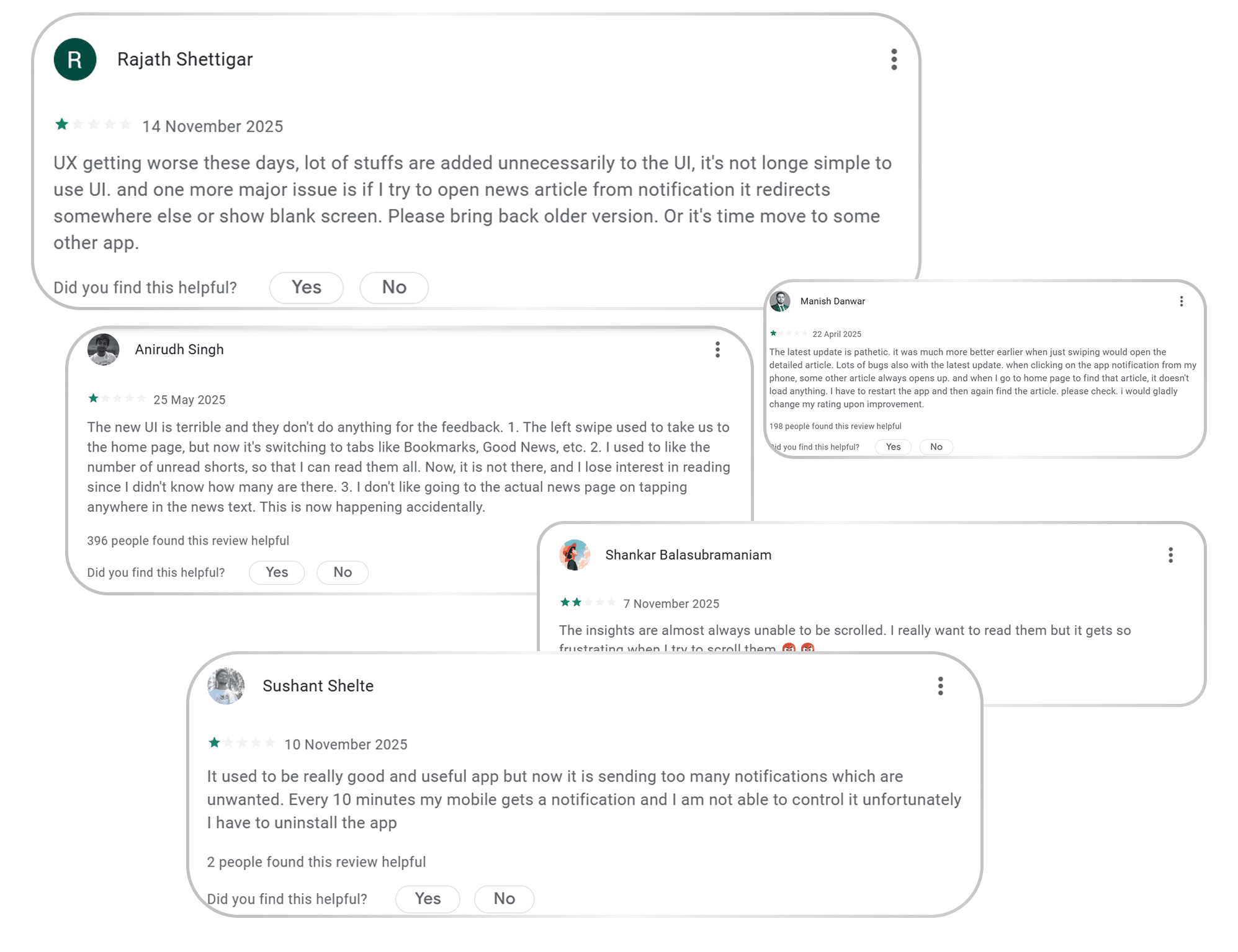
Based on 1,000+ App Store reviews, and my personal experience using the app, the biggest user concerns were:
Underused & Outdated UI
The interface feels overly minimal to the point where it looks empty and unpolished. Large areas of the screen are underutilized, and the overall visual design feels more like an MVP than a mature, established news platform.
My goal wasn’t to over-decorate the UI, but to modernize it, introduce structure, and still keep the simplicity Inshorts is known for.
Excessive, Interruptive Ads
While I cannot do much about this point, as it is directly proportional to the revenue model of Inshorts but I tried to give a few solutions by proposing different revenue streams and making the ad experience less frustrating.
Irrelevant Notifications
Users repeatedly complained that notifications were “spammy,” “not useful,” and “too frequent,” causing many to disable them entirely.
Poor Personalization
For an app consumed daily, the experience feels surprisingly generic. Recommendations do not adapt well to reader behaviour, which makes the feed feel repetitive.
Improving personalization became a key part of the redesign to ensure users feel the app is actually made for them, not for “everyone.”
Simple yet Complex Information Architecture
I did not even know Inshorts had a video feature until I was researching reviews on the Play Store, and in the app preview images, they mentioned about this feature. It was buried under the category swiping panel on top. Which i thought was not intuitive. And like this, there were many other missed opportunities according to me, which i tried to implement.
How I tried to solve each problem (one by one)
1. Reimagining the Home Screen (The Most Underused Thing)
The previous home screen felt underused, bland, and almost treated as an afterthought. Its only real purpose was to push users straight into the news-reading section. Important features felt scattered, rushed, or hidden.
But the home screen is the first impression of any app.
In Inshorts’ current flow, users are dropped directly onto a random story, which may not suit their mood, interest, or context every time.
I treated the home screen like the front page of a newspaper:
A place where users can get a quick sense of what’s happening, browse categories, discover new sections, and then choose what they want to dive into.
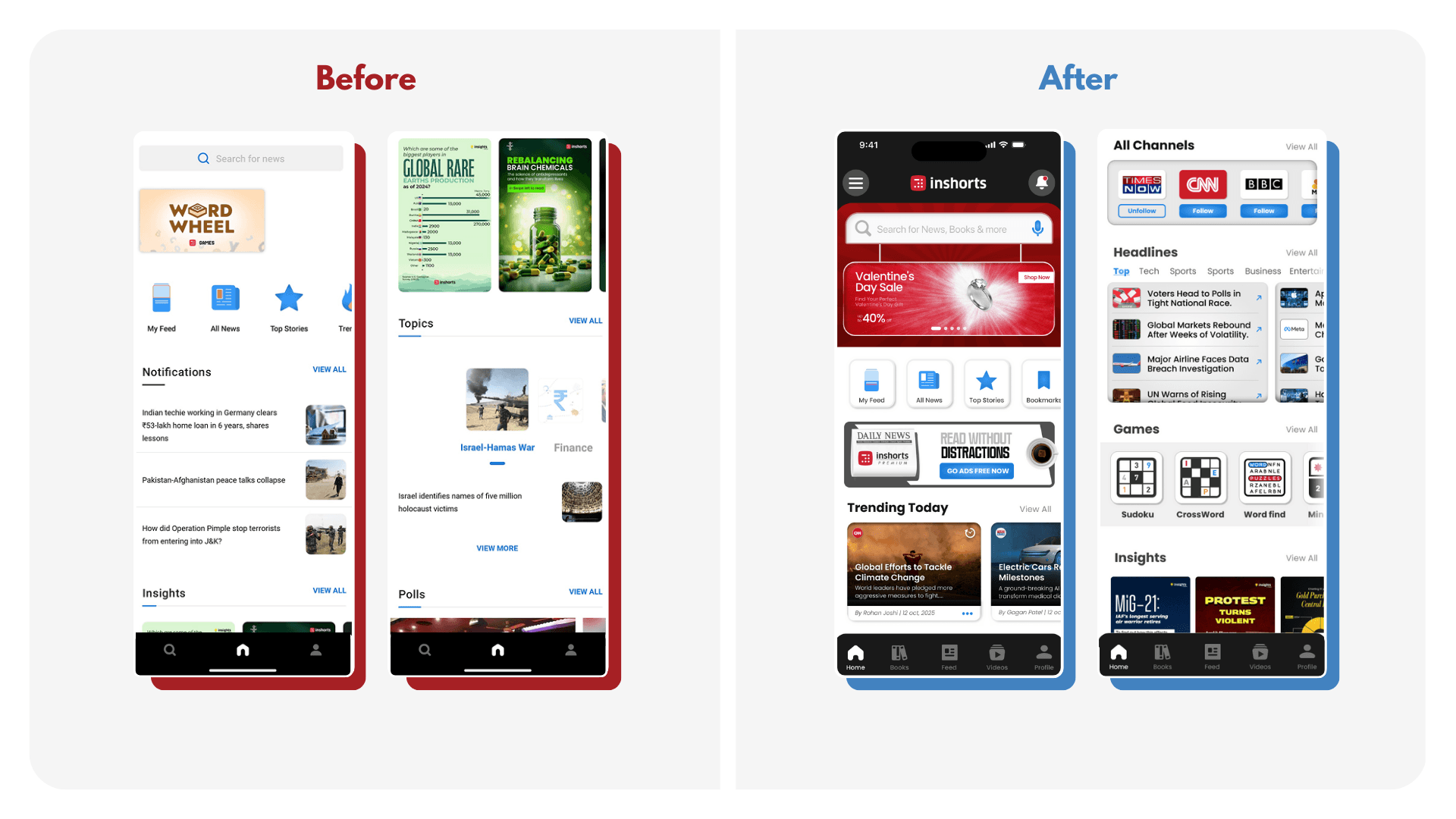
So I redesigned the home screen with a structure that’s simple but purposeful:
A large hero ad/banner at the top
Top hero banner ad section, like every other newspaper. Which in our case will be replaced by nice quotes, thoughts, illustrations, etc, if they are a premium member (I cover this more in the revenue section)Familiar navigation
I kept the core nav icons similar so the experience doesn’t feel “completely new” or confusing.Category-wise headlines
Let's users skim through their interests instead of being dropped into a random article.Follow sections for topics/channels
More control → more personalization → more retention.Dedicated games section
The old version had ONE random game placed at the top for no clear reason.
I organized all mini-games together, making it an intentional section.An “Inshorts Books” section
A new revenue + engagement opportunity (explained later). Adds depth without overwhelming the UI.
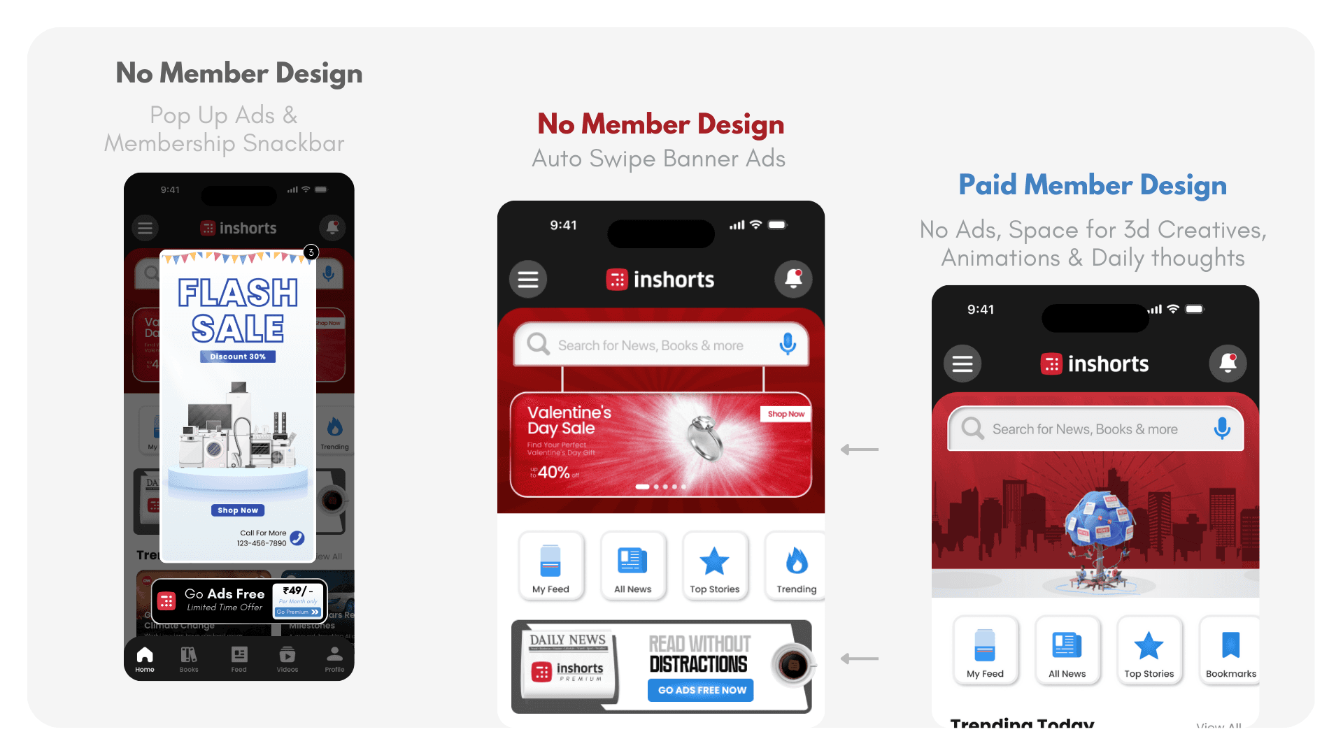
2. Exploring New Revenue Opportunities (& Design Changes)
The current app relies heavily on mid-scroll ads in the news feed section, which interrupts the reading experience and creates fatigue. My goal was to distribute the revenue load more intelligently while introducing new monetization & engagement opportunities that still respect the user experience.
Here are my suggested additions:-
Hero Banner Ads
I introduced a 10-second auto-scrolling hero banner on the home screen. Every user sees it upon opening the app, making it premium inventory. Ad visibility ranking (1st slot, 2nd slot, etc.) can be priced differently.Pop-Up Ads + Membership Prompt
Non-members get occasional pop-ups, paired with a contextual membership snackbar that naturally nudges them to upgrade without feeling forced.
Inshorts Books Section
A new vertical where popular non-fiction books are broken down chapter-wise under 60 words, similar to the company’s core identity. Users can purchase full books through partner links, while authors can publish summaries or promote their books within the platform.
Followable News Channels: Each news card now shows the source as a followable channel similar to Instagram. Users can follow or unfollow specific media outlets, creating a deeper personalization loop and a new ad inventory for channels.

Improving Navigation & Information Flow
The previous navigation depended heavily on side-swiping between categories and sections. While simple, it wasn’t intuitive and often caused disorientation because swipe directions overlapped with in-feed actions. (also i felt swiping can be used in a more smart way for personalization)
My approach was to simplify the entire flow:
Dedicated Video Tab: I added a full video section in the main bottom navigation, using the unused space to give users a direct place to watch video news, similar to Reels on Instagram. It creates a richer and more immersive alternative to endless scrolling.
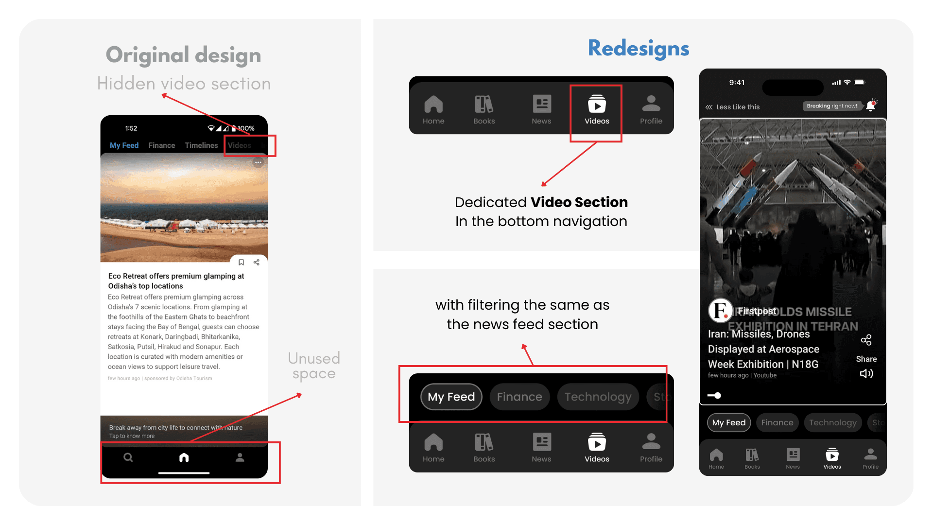
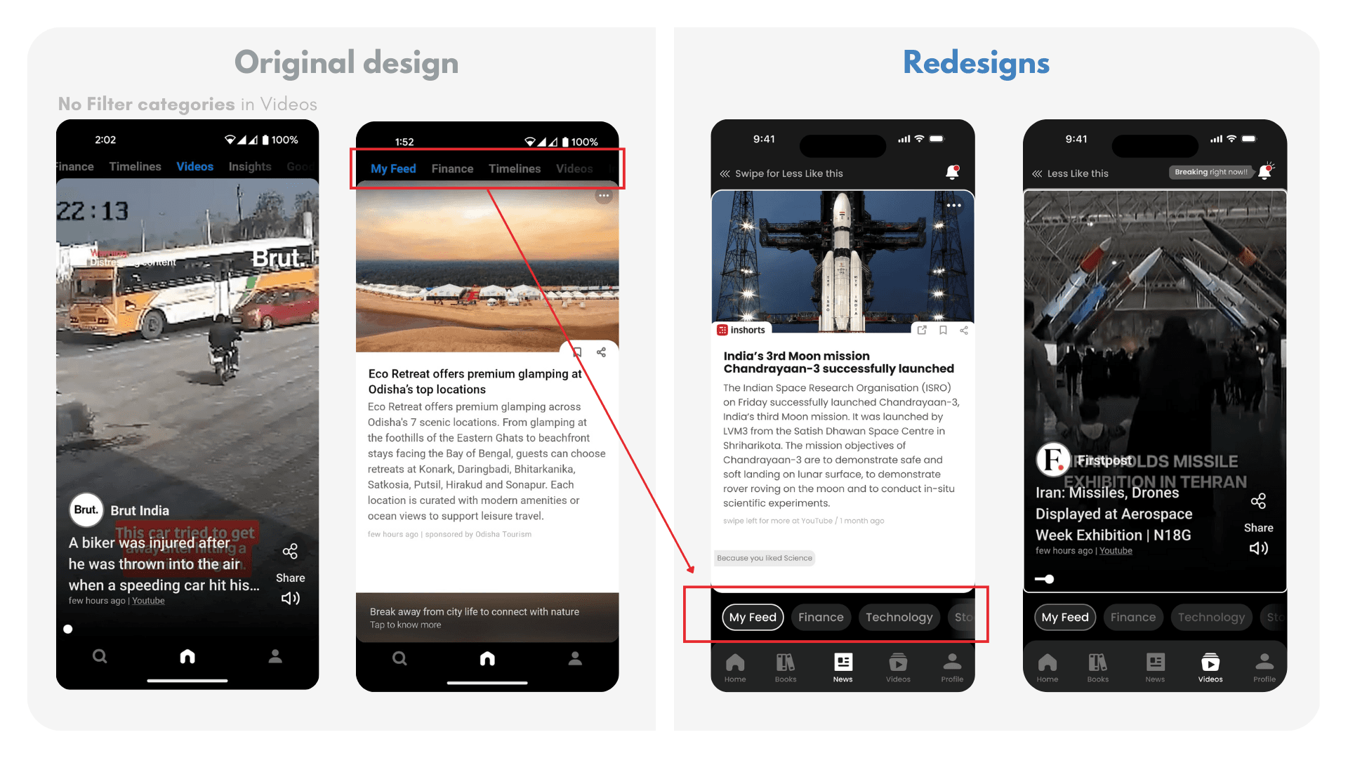
Clearer Category Navigation: News Category navigation was previously at the top which was categories mixed with different other things like videos, timelines etc. is moved to an easier-to-reach strip just above the main bottom nav. This eliminates confusion created by swipe-based category switching and improves reachability. (With now swipes being used for different things which i talk next in the case study)
Fixing the Personalization logic (Algorithmic UX)
In the original app design, if users disliked a piece of news, they had to tap three dots → choose “like or dislike” → confirm. (but its for the whole category and not the particular news you disliked)
This created unnecessary friction and discouraged personalization.So I redesigned the interaction:
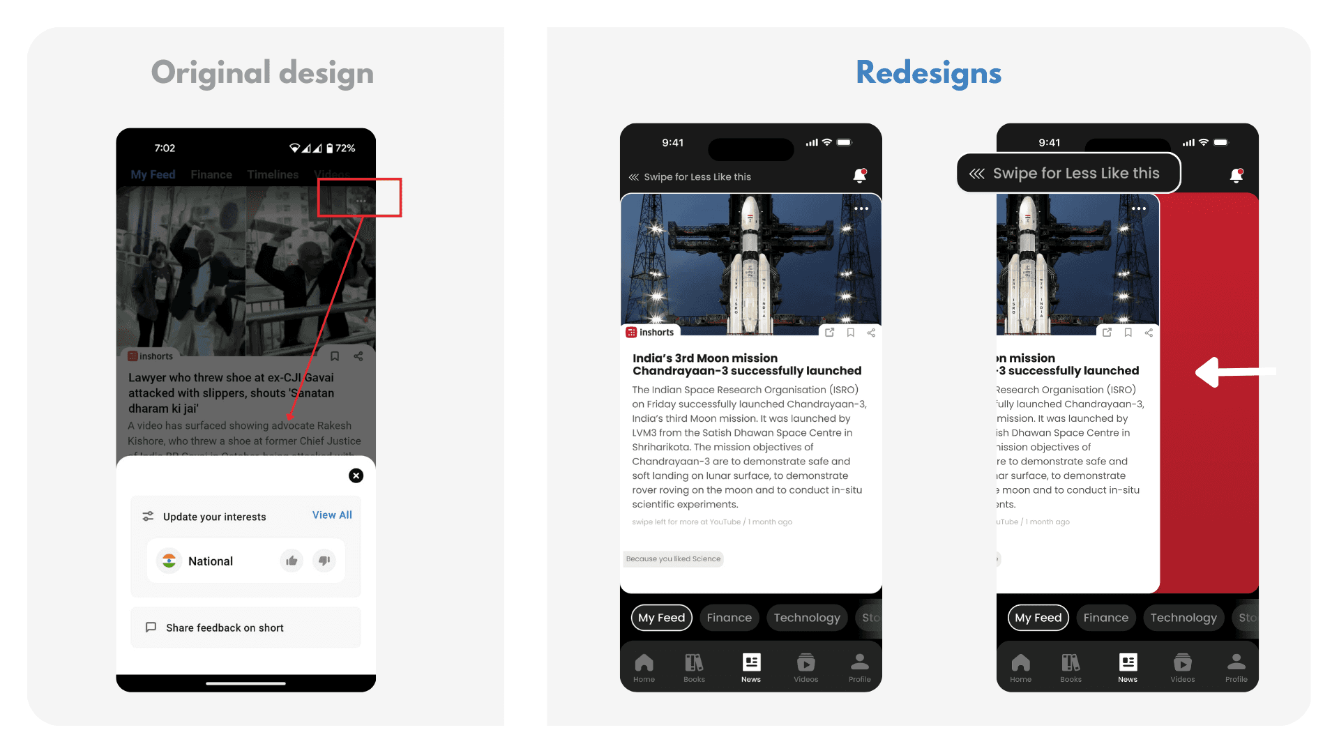
Swipe Left = Less Like This: A simple left swipe while reading a card marks it as “less like this,” reducing cognitive load. Users no longer need to dive into menus repeatedly.
Implicit Personalization: The app infers preferences based on what users naturally scroll through. If you scroll past something quickly, it counts as mild disinterest. If you swipe left, it counts as explicit disinterest. (No swipe right as you can navigate your way everywhere easily from buttons and filters close to the reach. So app be used easily with one hand )

Refining The Notification System
The original app displayed only three notifications on the home screen, which wasn’t clear or useful. Notifications felt irrelevant and lacked hierarchy.
I redesigned notifications with clear intent and context:
Dedicated Bell Icon on top of the feed for clarity and consistency.
Three Notification States:
Breaking Now: For extremely urgent, high-priority updates.
Emergency News: Government alerts, weather warnings, public announcements.
Unread News: When a user leaves the app mid-feed and returns, they see how many stories they missed.

This creates:
More intentional engagement
Reduced notification fatigue
A sense of continuity when users return
Reflections
This project helped me realize that good design isn’t just about making screens look better, it’s about questioning assumptions, understanding user behavior, and balancing usability with business goals. I also learned the importance of validating ideas through testing rather than relying only on intuition. If I were to continue this project, my next step would be user interviews and prototype testing to refine decisions based on real behavior, not just assumptions.
Thank you for reading!! Test the Working prototype in Fullscreen Here ⤵︎
Disclaimer: This is a self-published project, and in no ways associated to Inshorts professionally. The views from this case study are strictly my own and I took a heuristic approach to redesign the Inshorts app. This case study isn’t in depth or detail, as I didn’t have full access to the user data of the application. Hence, I am certainly not suggesting that Inshorts must endorse into my redesign. This is my attempt to improve my design aptitude by analysing a popular app.
What is Inshorts & Why I chose to redesign it?
I’ve been an active Inshorts user for years because it’s simple, fast, and helps me stay updated without the noise and drama of TV or long-form platforms.
But the more I used it, the more I felt the app was sitting on a huge untapped opportunity. With the right experience, Inshorts could offer the same addictive “scroll habit” as Instagram, but powered by meaningful, high-quality information instead of mindless dopamine.
This redesign explores how Inshorts can evolve from a quick-news utility into a more trustworthy, personalised, and engaging daily news companion.
Design Intent & Focused Areas
In this reimagined version of Inshorts, I wanted to look at the product from all three angles:
The user perspective (how people consume news, what frustrates them, what they actually want)
The curator side (publishers, authors, and sources who create the content)
The business needs of Inshorts as a product and a company.
My goal wasn’t just a visual refresh; it was to rethink how the entire ecosystem works together. to increase potential revenue while keeping the flow simple and intuitive.
A Win-Win for all parties involved.
Usability Gaps in the Current App Experience
Based on 1,000+ App Store reviews, and my personal experience using the app, the biggest user concerns were:
Underused & Outdated UI
The interface feels overly minimal to the point where it looks empty and unpolished. Large areas of the screen are underutilized, and the overall visual design feels more like an MVP than a mature, established news platform.
My goal wasn’t to over-decorate the UI, but to modernize it, introduce structure, and still keep the simplicity Inshorts is known for.
Excessive, Interruptive Ads
While I cannot do much about this point, as it is directly proportional to the revenue model of Inshorts but I tried to give a few solutions by proposing different revenue streams and making the ad experience less frustrating.
Irrelevant Notifications
Users repeatedly complained that notifications were “spammy,” “not useful,” and “too frequent,” causing many to disable them entirely.
Poor Personalization
For an app consumed daily, the experience feels surprisingly generic. Recommendations do not adapt well to reader behaviour, which makes the feed feel repetitive.
Improving personalization became a key part of the redesign to ensure users feel the app is actually made for them, not for “everyone.”
Simple yet Complex Information Architecture
I did not even know Inshorts had a video feature until I was researching reviews on the Play Store, and in the app preview images, they mentioned about this feature. It was buried under the category swiping panel on top. Which i thought was not intuitive. And like this, there were many other missed opportunities according to me, which i tried to implement.
How I tried to solve each problem (one by one)
1. Reimagining the Home Screen (The Most Underused Thing)
The previous home screen felt underused, bland, and almost treated as an afterthought. Its only real purpose was to push users straight into the news-reading section. Important features felt scattered, rushed, or hidden.
But the home screen is the first impression of any app.
In Inshorts’ current flow, users are dropped directly onto a random story, which may not suit their mood, interest, or context every time.
I treated the home screen like the front page of a newspaper:
A place where users can get a quick sense of what’s happening, browse categories, discover new sections, and then choose what they want to dive into.
So I redesigned the home screen with a structure that’s simple but purposeful:
A large hero ad/banner at the top
Top hero banner ad section, like every other newspaper. Which in our case will be replaced by nice quotes, thoughts, illustrations, etc, if they are a premium member (I cover this more in the revenue section)Familiar navigation
I kept the core nav icons similar so the experience doesn’t feel “completely new” or confusing.Category-wise headlines
Let's users skim through their interests instead of being dropped into a random article.Follow sections for topics/channels
More control → more personalization → more retention.Dedicated games section
The old version had ONE random game placed at the top for no clear reason.
I organized all mini-games together, making it an intentional section.An “Inshorts Books” section
A new revenue + engagement opportunity (explained later). Adds depth without overwhelming the UI.
2. Exploring New Revenue Opportunities (& Design Changes)
The current app relies heavily on mid-scroll ads in the news feed section, which interrupts the reading experience and creates fatigue. My goal was to distribute the revenue load more intelligently while introducing new monetization & engagement opportunities that still respect the user experience.
Here are my suggested additions:-
Hero Banner Ads
I introduced a 10-second auto-scrolling hero banner on the home screen. Every user sees it upon opening the app, making it premium inventory. Ad visibility ranking (1st slot, 2nd slot, etc.) can be priced differently.Pop-Up Ads + Membership Prompt
Non-members get occasional pop-ups, paired with a contextual membership snackbar that naturally nudges them to upgrade without feeling forced.
Inshorts Books Section
A new vertical where popular non-fiction books are broken down chapter-wise under 60 words, similar to the company’s core identity. Users can purchase full books through partner links, while authors can publish summaries or promote their books within the platform.Followable News Channels: Each news card now shows the source as a followable channel similar to Instagram. Users can follow or unfollow specific media outlets, creating a deeper personalization loop and a new ad inventory for channels.
Improving Navigation & Information Flow
The previous navigation depended heavily on side-swiping between categories and sections. While simple, it wasn’t intuitive and often caused disorientation because swipe directions overlapped with in-feed actions. (also i felt swiping can be used in a more smart way for personalization)
My approach was to simplify the entire flow:
Dedicated Video Tab: I added a full video section in the main bottom navigation, using the unused space to give users a direct place to watch video news, similar to Reels on Instagram. It creates a richer and more immersive alternative to endless scrolling.
Clearer Category Navigation: News Category navigation was previously at the top which was categories mixed with different other things like videos, timelines etc. is moved to an easier-to-reach strip just above the main bottom nav. This eliminates confusion created by swipe-based category switching and improves reachability. (With now swipes being used for different things which i talk next in the case study)
Fixing the Personalization logic (Algorithmic UX)
In the original app design, if users disliked a piece of news, they had to tap three dots → choose “like or dislike” → confirm. (but its for the whole category and not the particular news you disliked)
This created unnecessary friction and discouraged personalization.So I redesigned the interaction:
Swipe Left = Less Like This: A simple left swipe while reading a card marks it as “less like this,” reducing cognitive load. Users no longer need to dive into menus repeatedly.
Implicit Personalization: The app infers preferences based on what users naturally scroll through. If you scroll past something quickly, it counts as mild disinterest. If you swipe left, it counts as explicit disinterest. (No swipe right as you can navigate your way everywhere easily from buttons and filters close to the reach. So app be used easily with one hand )
Refining The Notification System
The original app displayed only three notifications on the home screen, which wasn’t clear or useful. Notifications felt irrelevant and lacked hierarchy.
I redesigned notifications with clear intent and context:
Dedicated Bell Icon on top of the feed for clarity and consistency.
Three Notification States:
Breaking Now: For extremely urgent, high-priority updates.
Emergency News: Government alerts, weather warnings, public announcements.
Unread News: When a user leaves the app mid-feed and returns, they see how many stories they missed.
This creates:
More intentional engagement
Reduced notification fatigue
A sense of continuity when users return
Reflections
This project helped me realize that good design isn’t just about making screens look better, it’s about questioning assumptions, understanding user behavior, and balancing usability with business goals. I also learned the importance of validating ideas through testing rather than relying only on intuition. If I were to continue this project, my next step would be user interviews and prototype testing to refine decisions based on real behavior, not just assumptions.